WatchGuard Video Video Evidence Management System Redesign

WatchGuard Video is the leading provider of mobile video solutions for law enforcement, supplying in-car video systems, body-worn cameras, and evidence management software to approximately one-third of all law enforcement agencies in the United States and Canada. WatchGuard hired me as their User Experience Engineer to design, develop and implement a complete solution for the Evidence Management Software.

The Objective

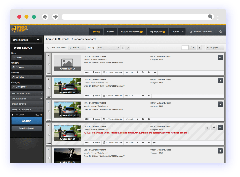
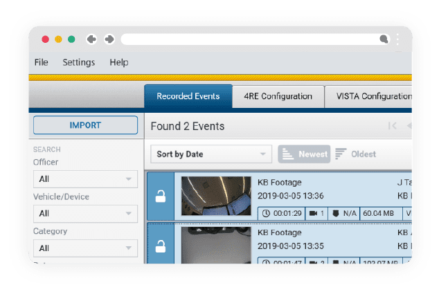
To completely redesign the application interface, with a primary focus on optimizing its search capabilities and the user journey for a major version update of an existing application while addressing the shortcomings of the current application interface. Additionally, this new Major Version release would introduce two highly-complex features - In-Browser Video Trimming, Editing and Exporting, and Video Evidence Sharing that retain the chain of command signatures.

The Problems Faced:

At its core, UX is problem-solving. This application is responsible for uploading, storing, searching, sorting, and sharing Police Video evidence from Body-warn and in-car or motorcycle-mounted cameras - a complex process with various regulatory and feature requirements. The starting point for this project began by assessing the assumptions made about the current user journey. What do we think we know about our customers? How do we think they interact with the app? The Engineering, Marketing, and Executive teams played vital roles in identifying these assumptions. The current application contained known (reported) usability issues, and I was facing a very short deadline for a complete interface re-design by coming into the project late as a replacement for a contract design team. The company had no UX Researcher(s) on staff and was not inclined to hire any this late into the development cycle.

My Process

With a deadline looming and limited staff resources, it was apparent that the best solution was to dig right into the research. I attained all available user analytics, had numerous discussions with stakeholders, Department Managers, and industry experts, and identified existing issues and potential solutions to the new features coming in this major update. With the initial, though sparse, research concluded, I was tasked with creating the User Story Map, which provided clear visibility of the tasks the users would perform. By referencing the Story Map, our teams were able to attain a clear picture of what the minimum viable product should be. With user goals defined, I drafted sketches to provide quick, efficient iterative testing of solutions. I made it a priority to include key stakeholders in the sketching process. Engineering Developers, we had in meetings and UI / UX presentations - Involving the Engineer Team in Design = Mind Blown! The Engineering team provided valuable insight into past user experiences and contributed to suggestions for implementation that would achieve both the UX and Launch goals.
1. Research

2. Sketching & Live Mock-ups

3. Application Interface Development

4. Project Delivery

Research

My first step was to research what we thought we knew about our users, to uncover all available user analytics and identify the key stakeholders and industry experts for later review purposes. I conducted multiple User interviews and informal surveys. This information was invaluable and confirmed many assumptions as well as identified areas we had 'missed' the users expectations.

Let the Sketching begin...

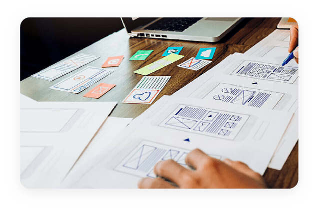
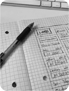
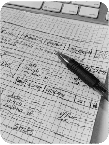
Once I had an understanding of our goals, I began to work up Sketches, iterating through issues discovered during user interviews and addressing usability issues with the current application interface.

After the initial wire-frames were completed, and peer-review and stakeholder feedback was received and applied appropriately, I moved directly into developing Live Mock-ups, creating much of the HTML, CSS and JS that the live app would utilize. This allowed me to demonstrate the design and usability solutions in a way that redeemed development time later in the cycle. The Engineering teams greatly appreciated this.

The Sketching process can be tedious but it's an essential method to quickly iterate and test solutions to visual design problems. Sketches were used as references during Scrum Stand-ups and Team meetings, to illicit helpful feedback and insights into the project.

Front-end Development

With the final stretch of the development sprints firmly in front of us I went to work finalizing the front-end code for the application. The Interface was implemented with a combination of Bootstrap CSS framework and custom-coded, object-oriented modules for each of the feature requirements. All code was formatted, linted and W3C Validated. From there the interface was merged into templates used in the apps development .Net stack. Unit and user testing was completed and the app was approved for launch.